ISAL
Situation
A brand new school that offers comprehensive English as a Second Language (ESL) programs and workshops that are designed to help students advance outside as well as inside the classroom. Founded in Allston, MA, the founders approached me at the end of November 2013 to create their company identity.
Solution
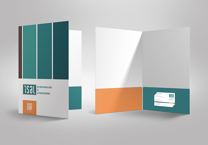
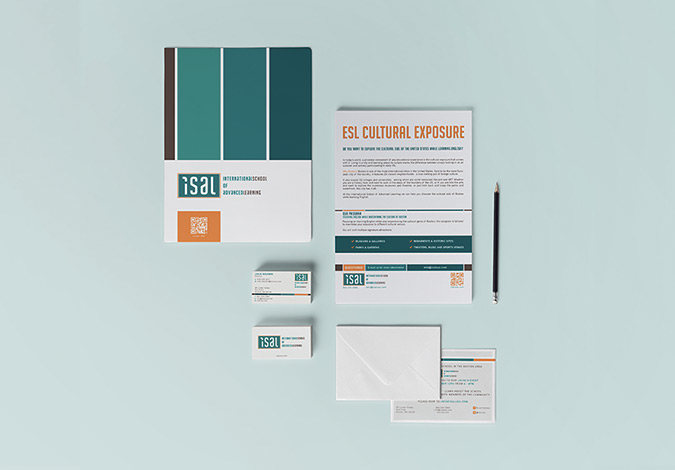
Being a brand new school and not just another company, ISAL required special attention and more than just brand identity with a great logo. From business cards, to class brochures, to program folders, to unique letterhead and even custom USB drives, this project is in a constant state of update with weekly design requests from the client.
Result
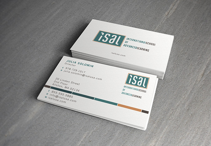
Because of the long name the client asked for a logo that will consist of four letters as well as the full name of the school. The first two letters of the logo “IS” try to mirror horizontally and vertically the last two letters “AL”. Having the word section of the logo align perfectly to the right of the icon as well as to the bottom of the icon makes the logo more versatile to use both layout styles if there is a real estate is limitation. Using a complimentary orange color around the icon of the logo grabs your attention and gives it a warmer feel than using colors such as emerald and dark gray.